
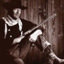
This one or the one currently in my sig?

Which sig pic do think is best?
There are 32 replies in this Thread which has previously been viewed 7,775 times. The latest Post () was by Lt. Brannigan.
Participate now!
Don’t have an account yet? Register yourself now and be a part of our community!
-
-
-
I like the bottom one better, although I think it would be even better if it was smaller. The top one looks like John Wayne is shooting himself.
BTW, I see you're from Pocatello - I was there a few years ago visiting a good friend who still lives there.
Chester

-
I agree with Chester. Bottom one looks better. and it could be a tad bit smaller.
-
I prefer the upper one, Wayne is not shooting himself, it's just a mirrow impression, while in the lower one he's shooting me that I don't like!
-
Both have their points, but I think I prefer the bottom one.
Cheers - Jay
-
Awesome, I got some genuine input and the winner is the bottom one by 3-1. I will be making it smaller right now as per you your suggestion. Thanks for the input very much!
QuoteWayne is not shooting himself
I knew that this would present a problem, but it's one I can live as I think the overall effect is rather nice. But I do value everyones creative input.
I just resized it as per your suggestions. Anymore advice?
-
Yeah, tell me how I can make one!!!!!!!!!!
-
I used paintshop pro for my picture, but there are other programs available to do so. But Corral's Paintshop Pro is the one that I feel is best. However I am willing to make you a pic provided you give me what movie you would like it to be based on.
-
I used paintshop pro for my picture, but there are other programs available to do so. But Corral's Paintshop Pro is the one that I feel is best. However I am willing to make you a pic provided you give me what movie you would like it to be based on.
No movie. I want an avatar of a solid black 97 mustang GT!!!!! -
That will be easy enough to do, just give me a week and I can have it ready to go.
-
-

No movie. I want an avatar of a solid black 97 mustang GT!!!!!
Just to make sure I understand correctly so I can give you what you want, you want that little pic beside you name right?
-
I agree with the majority, I like the bottom one better and a bit smaller. Im almost afraid to ask opinions on my loooooooooooooooong signature quote ;-D and when I can find the time to get it printed out, my sig quote will change for the better.
-
Ask away... the worst that can happen is I make you feel superior to me...
-
Just to make sure I understand correctly so I can give you what you want, you want that little pic beside you name right?
Yup. Then later I would like a bigger pic like you have. But one thing at the time. -
One more thing... should I shrink my pic again?
-
Yup. Then later I would like a bigger pic like you have. But one thing at the time.
Good... when I understand clearly I can be a lot more useful.
-
Take a look at what I have attached, let me know if you like any of those, if not I will work on another batch.
-
I agree that the bottom picture was the best but in my honest opinion I do believe that it is quite flawed. The picture on the far left makes Duke look really old while the picture on the far right looks like its from a reverse angle, however the large picture in the centre is just terrific and I think it may be more effective if it was on its own with maybe the yellow car or tower bridge etc in the background.
Duly noted, The reason that the picture on the left makes Duke look real old is cause of the way I scanned in the picture.... I forgot to take it off the box before scanning
 . As for the reverse angle, I did indeed mirror the image to get what I required, I admit it's not the best. I will later play around with those suggestions.
 -
This isn't a torrent site... big sig photos are not the norm here. I prefer a nice Duke quote...
-